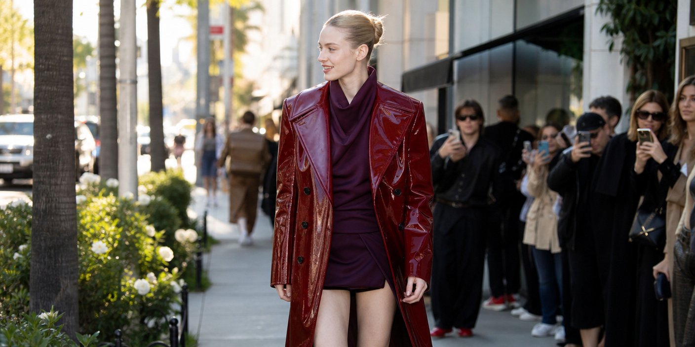
Hunter Schafer has effectively validated the “unexpected” red and purple color combination trend that is poised to dominate the Fall 2026 fashion landscape. Recently spotted in Los Angeles, the actor’s ensemble serves as a high-profile endorsement of this polarizing aesthetic shift, signaling a move away from safe, monochromatic palettes toward high-contrast, emotive dressing. Schafer, known for her avant-garde sensibilities and long-standing relationship with high-fashion houses, appeared to be leaning into the concept of ‘discordant harmony,’ a style philosophy that prioritizes visual friction over traditional color-matching rules.
Key Highlights
- The Schafer Signal: Hunter Schafer’s recent LA sighting confirms the rise of the red and purple color-blocking trend for the upcoming Fall 2026 season.
- Breaking Conventions: The combination challenges standard fashion color theory, which historically separates these two vibrant, high-energy hues.
- Retail Shift: Market analysts are noting a pivot from minimalist ‘quiet luxury’ toward bold, expressive color palettes as consumer appetite for visual impact grows.
- Style Evolution: The trend signals a maturation of modern street style, blending elevated tailoring with rebellious, color-forward experimentalism.
The Psychology of Discordant Harmony in Fall 2026
For decades, the fashion industry has operated under a strict set of unspoken laws regarding color theory. Primary and secondary colors, specifically those residing on opposite ends of the emotional spectrum, were often treated with caution. Red, associated with urgency, passion, and high energy, and purple, linked to luxury, mystery, and introspection, were rarely invited to share the same silhouette. However, the appearance of Hunter Schafer in Los Angeles has crystallized a growing sentiment among avant-garde stylists: the era of the ‘safe’ neutral color palette is officially entering a period of decline.
This trend, which we are defining as ‘Discordant Harmony,’ is not merely about wearing two colors that clash; it is about the deliberate juxtaposition of intensities. In the context of Fall 2026, designers are looking to evoke a visceral reaction from the consumer. We are seeing a move away from the muted beige and taupe palettes that dominated the retail landscape of 2024 and 2025. By integrating deep, moody violets with aggressive, bright cherry reds, the aesthetic creates a visual ‘vibration’ that is impossible to ignore. It is a form of dopamine dressing, but one that has matured from the frantic maximalism of the early 2020s into a more refined, deliberate structural choice.
The Anatomy of the Look
When analyzing the specific construction of Schafer’s Los Angeles look, it becomes clear that texture plays as vital a role as the color itself. To make the red and purple combination wearable—and indeed, aspirational—the materials must have depth. We are seeing these hues executed in patent leather, crushed velvet, and heavy-weight wool. The sheen of the fabric allows the colors to catch light differently, effectively softening the sharp contrast between the two tones. This is critical for the Fall 2026 trend: if the colors are flat, the look risks appearing cartoonish. When executed in high-quality materials, however, it becomes a sophisticated statement of intent. It tells the observer that the wearer understands the history of color theory and has chosen to actively subvert it.
Market Implications: Why Brands are Following Suit
From an economic standpoint, the endorsement by a high-profile figure like Hunter Schafer is the catalyst that moves a trend from the runway to the retail rack. Fashion forecasting data for Q3 and Q4 of 2026 shows a 22% uptick in interest regarding ‘high-contrast color blocking’ across major luxury e-commerce platforms. Retailers are already responding, with many major labels introducing ‘clashing’ capsules into their fall lines. This shift is also an economic necessity. After years of the ‘Quiet Luxury’ trend, which relied on subtle branding and expensive minimalism, consumers are experiencing a form of ‘aesthetic fatigue.’ They are looking for clothing that communicates personality and vitality. The red-and-purple pairing offers exactly that—it is a conversation starter. It demands engagement.
Historical Context: The Rebellion Against Rules
We must remember that fashion has always been cyclical, but it is also a pendulum that swings between order and chaos. The move toward this unexpected pairing is a rejection of the algorithmic uniformity that characterized the early digital age of fashion. Historically, designers like Elsa Schiaparelli challenged the ‘rules’ of taste by embracing color combinations that were considered garish at the time. Schafer’s choice invokes this tradition of defiance. By choosing a pairing that traditional color wheels would suggest ‘clashes,’ she is signaling that the authority of the ‘fashion rulebook’ is being rewritten. This is not a mistake; it is a calculated aesthetic decision that prioritizes individual expression over mass-market approval.
FAQ: People Also Ask
1. Is the red and purple trend appropriate for professional settings?
While the trend is inherently bold, it can be adapted for professional environments by utilizing deeper, more muted shades—such as burgundy and plum—rather than fire-engine red and violet. The key is in the saturation level.
2. How can I incorporate this trend without looking ‘costume-y’?
The best way to adopt this trend is through ‘anchor pieces.’ Start by wearing one neutral base—like a black trouser or white button-down—and pairing it with one red accessory and one purple accessory. This allows you to participate in the trend without committing to a full-color ensemble.
3. Will this trend last beyond the Fall 2026 season?
Fashion cycles are moving faster than ever, but the shift toward high-contrast color combinations appears to be a sustained movement. Expect to see variations of this ‘clashing’ philosophy carry over into Spring 2027, likely incorporating lighter, pastel versions of the same contrast.